Packaging Color trends to watch for 2020
Predicting and implementing color trends is how marketers and package designers stay ahead of the curve and capture shoppers’ attention.
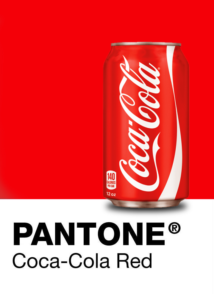
Coca-Cola Red Pantone Color
The most significant design factor to consider when creating packaging is without a doubt color — think about the most iconic brands, and you’ll be able to recall their brand colors. Coca Cola’s red aluminum cans are instantly recognizable by a seven-year-old, as is Tiffany’s blue color.
A brand’s identity is closely tied to the colors it uses because colors often elicit strong emotions. Your brand’s color identity can transform your brand’s look and feel, so it is crucial to choose your colors wisely. While your brand’s core colors, such as your logo, should stay the same, there’s value to incorporating fresh colors into your packaging.
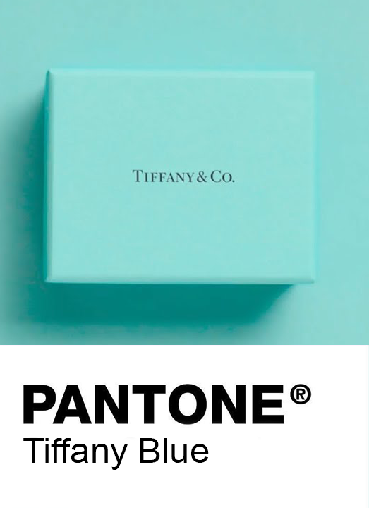
Tiffany Blue Pantone Color
Color is a simple, yet powerful form of messaging. It portrays a wide range of emotions without so much as a word or image. Color can highlight something important or just as easily disguise something insignificant. It can invoke the past, inform the present, and inspire the future. The role color plays in our visual world is so absolute that its power is hard to overestimate.
Color trends are constantly changing, and if you want your color palettes to follow these trends, you need to keep your finger on the pulse of what’s going on in the world of design—and what color trends are emerging as the go-to standard for the upcoming year.
That’s why we’ve composed this comprehensive list of packaging color trends to watch for 2020. Brilliant and engaging colors have popped on the scene for 2020.
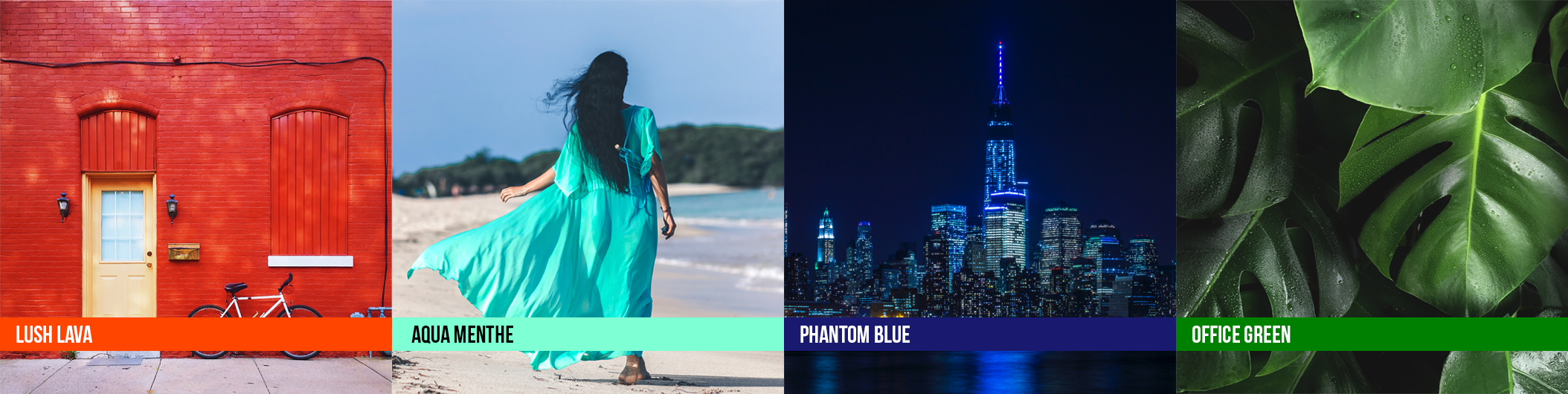
Shutterstock Color Trends 2020
1. Lush Lava
In practical use, this exciting color easily catches the eye—a perfect tool for companies looking to immediately draw attention to their branding. Culturally, this shade represents happiness, love, and good health in Asian countries—something to keep in mind when communicating with that audience.
2. Aqua Menthe
The bright, yet serene tone is perfect for conveying a playful, modern, and outgoing personality. Whether used as an accent or as a main color, it’s an excellent choice for fun and contemporary brands. In the islands of the Caribbean, people love to splash this tropical shade across houses and buildings to create an uplifting landscape.
3. Phantom Blue
Darker tones communicate stability, trustworthiness, and sophistication—and Phantom Blue is no exception. While it’s striking on its own, it’s also the perfect companion for pops of bright, contrasting colors such as the aforementioned Lush Lava and Aqua Menthe. This versatility hasn’t escaped creatives in Australia, Germany, and Spain, where its popularity is booming.
Source: Shutterstock
Shutterstock Color Trends 2020
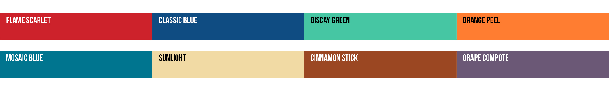
New York Fashion Week Spring / Summer 2020 Pantone Colors
According to Pantone Color Institute color experts, colors for Spring/Summer 2020 New York express our desire for a sense of the familiar. Friendly and relatable, a palette of colors that conveys a sense of ease. At the same time, in this era of personalized self- expression, this palette of recognized favorites uses the familiar to take some unique twists and turns highlighting elements of humor, modernity and entertainment.
New York Fashion Week Spring / Summer 2020 Pantone Colors
London Fashion Week Spring / Summer 2020 Pantone Colors
According to Pantone Color Institute’s colour experts, colours for Spring/Summer 2020 London blend a palette of iconic favorites with seasonal neutrals to create a narrative of colour artistry. Taking a spontaneous colour approach through patterning and multi-coloured layers Spring/Summer 2020 colours highlight the continued desire for energetic contrasts and personalized self-expression, creating a rousing and robust colour story where the underlying message is determination and hopeful optimism.
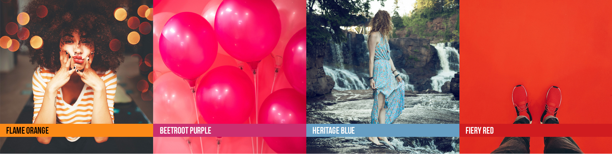
London Fashion Week Spring / Summer 2020 Pantone Colors
Source: Pantone
What is the 2020 Pantone Color of the Year?
The essential color to watch in 2020 is the 2020 Pantone Colour of the Year. This year’s winner is an iconic color you have likely seen before: Pantone 19-4052 Classic Blue. Classic Blue is a calm and familiar hue that will transport you to nostalgic summers by the water. Pantone describes the color as enduring and stable: “We are living in a time that requires trust and faith. It is the kind of constancy and confidence that is expressed by Pantone 19-4052 Classic Blue, a solid and dependable blue hue we can always rely on,” says Leatrice Eiseman, Executive Director of the Pantone Color Institute.
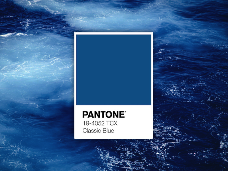
Pantone Colour of the Year 2020
If you want to establish credibility and familiarity with your consumers, lean into incorporating classic blue into your packaging color palette this year.